Style
On this page you can see how different elements are styled on this website. I have not used any pre-packaged themes; all CSS was handwritten from the ground up.
While this website is designed to be fully responsive using media queries, it is best viewed on desktop.
Colour palette
This site gives you the option to switch between light and dark modes by using the toggle on the top navigation menu. All elements are dynamically repainted in the following colour schemes. No elements use harcoded colour values.
Light mode
Primary background #f8f6f1
Secondary background #f5f5f5
Tertiary background #ebe1d5
Primary text #101519
Secondary text #13213c
Border colour #c6beb0
Accent #af4f41
Dark mode
Primary background #101519
Secondary background #181d23
Tertiary background #1c2129
Primary text #d8dce0
Secondary text #737a80
Border colour #262c33
Accent #1db4ac
Typography
This site uses the typeface Maiola from the foundry TypeTogether throughout. Code blocks and inline code use the monospace font Cascadia Mono. Here are various text elements set in these fonts.
Heading 1
Level 1 headings are set in the base font and the primary text colour, and have the following properties:
Font size: 3rem, Font weight: 400
Heading 2
Level 2 headings are set in the base font and the secondary text colour, and have the following properties:
Font size: 2rem, Font weight: 700
They are also styled with a trailing line that extends the full remaining width of the container and is set in the border colour.
Heading 3
Level 3 headings are set in the base font and the secondary text colour, and have the following properties:
Font size: 1.75rem, Font weight: 400, Text decoration: underline offset at 0.4rem
Heading 4
Level 4 headings are set in the base font and the secondary text colour, and have the following properties:
Font size: 1.5rem, Font weight: 400
h5 and h6 titles are not used on this website.
Paragraph text is set in the base font at 1.2rem. List elements share the font size.
Inline a elements in the body are set in the accent colour, with an underline offset at 0.4rem. On hover, elements transition to the primary text colour in 0.3s. Navigation links in the header and footer vary, with the header opting for a simple underline reveal on hover, and the footer transitioning from the primary text colour to the accent colour on hover.
Inline code snippets are set in the monospace font Cascadia Mono at 0.9rem(to offset variable font heights between this and the base font) and are enclosed in a background block with a border radius of 4px.
Code blocks are also enclosed in a background block with a boder radius of 4px and variable padding. Overflow triggers a scrollbar set in the accent colour at a width of 100px. (Browser support for scrollbar styles vary). Syntax highlighting is handled by the built-in Shiki integration. I'm using the default GitHub Dark theme from Shiki, and this does not currently switch to a light theme when the website theme is switched.
See example below.
/*Overriding the wdith and height specification required by Astro's <Picture /> tag and adding a border radius*/
 img {
    max-width: 100%;
    height: auto;
    display: block;
    border-radius: 4px;
 }
Blockquotes are italicised. They are 1.5rem in font size and styled in the secondary text colour, with a 1px left border styled in the accent colour. Blockquotes are only used for quotations rather than as a decorative element. See example below.
Arise, arise, Riders of Théoden!
Fell deeds awake: fire and slaughter!
Spear shall be shaken, shield be splintered,
a sword-day, a red day, ere the sun rises!
Ride now, ride now! Ride to Gondor!
Unordered lists use the default disc style and ordered lists use the default decimal style. Font colours are inherited from the parent. This is illustrated below.
Meals of the day
- Breakfast
- Second breakfast
- Elevenses
- Luncheon
- Afternoon Tea
- Dinner
- Supper
How to make taters
- Boil 'em
- Mash 'em
- Stick 'em in a stew
All text, except blog post titles, are left-aligned. Blog post titles are centre aligned-with a background set in the secondary background colour, on which the hero image (if available) overlaps with a -180px vertical spacing. See an example here.
Images
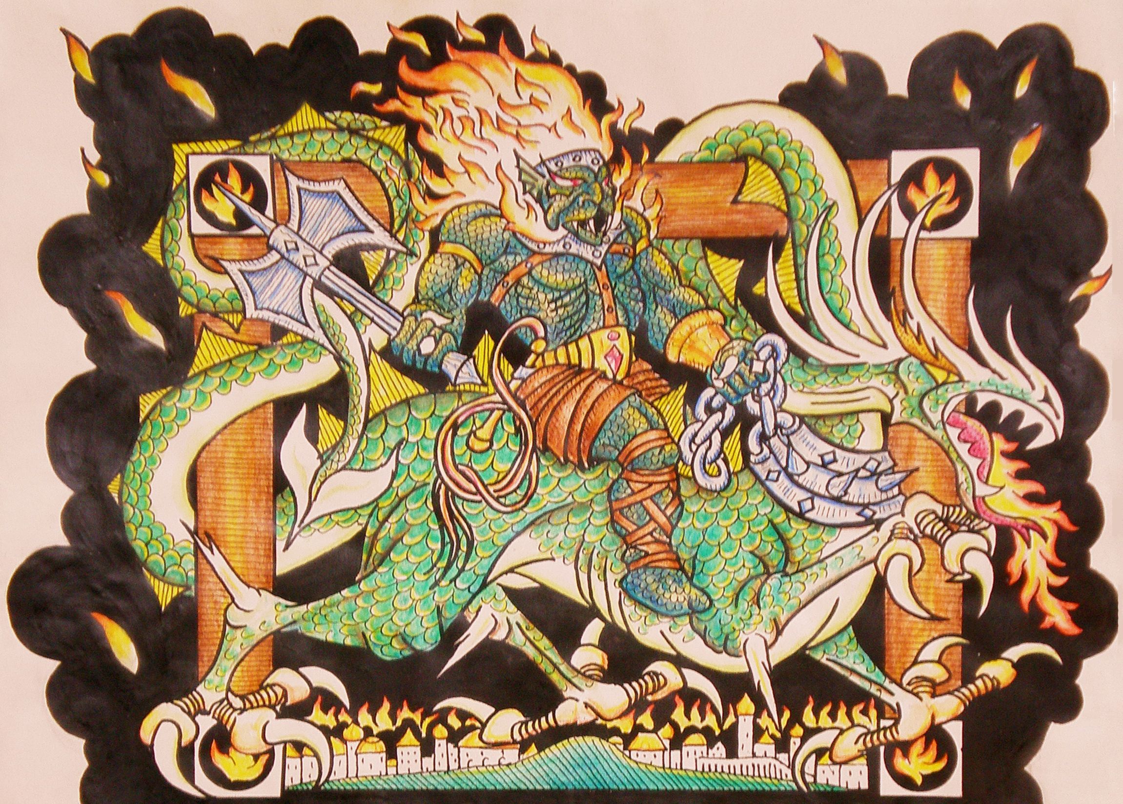
All images are served in AVIF with fallback to WebP, with a 4px border radius and have alt text. Captions, when used, are right aligned and italicised. They are set in a font size of 1rem and in the secondary text colour. Hyperlinks in the caption have no text decoration. See example below.
Other components
Grid elements have a 1px thick solid border set in the border colour, with a 4px border radius. The background is styled in the tertiary background colour. If the grid element is hyperlinked, the border transitions to the accent colour on hover.
This is an example of an unlinked grid element. See this in use on the Uses page.
This is an example of a linked grid element. See this in use on the Debas Archives page.
Post footers share the above styles (with the exception of the hover effect). On ordered lists inside post footers, numbers are styled in the accent colour. See example below.
Currently not in use
I'm currently not using tables, accordions, and definition lists within this website.